Why “Learn More” Links Hurt Accessibility (and What to Use Instead)
A row of tidy “Learn more” buttons looks clean in a mockup. To a screen reader user navigating by links, it reads as a list of identical, meaningless labels. Here is why vague link text is a real barrier, why it keeps showing up in designs, and how teams can fix it for good.
The problem: links are often read out of context
Sighted users scan a page visually. They see a heading, a paragraph, and a button together, so “Learn more” is obvious from what sits around it. Screen reader users often do not move through a page that way. One of the most common navigation methods is to pull up a list of every link on the page and jump between them, a feature built into every major screen reader.
In that list, the surrounding heading and paragraph are gone. All that remains is the link text itself. If four different links all say “Learn more”, the list becomes four identical entries pointing to four different places, with no way to tell them apart.
- Learn more
- Learn more
- Read more
- Learn more
Four links, four destinations, one indistinguishable label.
- Learn more about audit reports
- Learn more about monitoring
- Read our pricing guide
- Learn more about integrations
Every link makes sense on its own, out of context.
The same page, the same four links, viewed through a screen reader's links list. Only the wording changed.
Why it matters, and what WCAG requires
Beyond being confusing, vague link text fails a specific WCAG success criterion. The purpose of each link should be clear, ideally from the link text alone.
The purpose of a link can be determined from the link text, or from the text together with its surrounding context (the sentence, list item, or table cell it sits in).
The purpose of a link can be determined from the link text alone, with no reliance on surrounding context. This is a best practice target rather than a required baseline, but it reflects the real need when screen readers present links out of context in a links list.
Technically, “Learn more” can pass Level A if the surrounding context makes it clear and that context is programmatically available. In practice, the way assistive technology is really used (jumping between links, tabbing from control to control) means context is frequently stripped away. Even when context is available, repeated identical labels on the same page make navigation confusing and are widely discouraged in accessibility guidance. Writing link text that stands on its own is the reliable choice, and it is exactly what screen reader users consistently ask for.
Why “Learn more” keeps showing up in designs
This is rarely carelessness. Vague link text usually appears for understandable reasons, and naming them helps a team fix the cause rather than just the symptom.
Visual rhythm and alignment
Short, equal-length labels make a row of cards or buttons look balanced. A descriptive label like “Learn more about audit reports” is longer, may wrap to two lines, and can feel like it breaks the grid.
The mockup always has context
In the design file, the link sits directly under its heading, so it reads perfectly. The designer never sees it the way a links list does, with everything else removed.
Placeholder labels that never get revisited
“Learn more” is the default stand-in CTA, the link-text equivalent of lorem ipsum. It goes into the first draft and quietly survives all the way to production.
Design systems ship it as the example
A reusable button or card component often ships with “Learn more” as its sample label. Every instance inherits it unless someone deliberately changes the text.
How to explain it to the team
The fastest way to win this argument is to stop describing it and show it. Abstract appeals to compliance rarely change a design decision. A thirty-second demonstration usually does.
Run the links list live
Turn on VoiceOver (built into every Mac) or NVDA (free on Windows) and open the page's links list. When everyone hears “Learn more, Learn more, Learn more”, the problem becomes obvious without a single mention of WCAG.
Frame it as clarity, not compliance
Descriptive links help everyone: they improve scannability, give search engines better context, and make link previews and bookmarks readable. Accessibility is the floor, not the whole pitch.
Make the cost concrete
“A user who relies on a screen reader cannot tell these four links apart” lands harder than “this fails 2.4.4”. Tie it to a real person trying to complete a real task.
Three ways to fix it
Start from the same vague pattern, then pick the fix that fits the layout. All three are easy to implement.
<!-- The link text alone tells you nothing about where it goes -->
<h3>Accessibility audit reports</h3>
<p>See what every report includes and how to read your score.</p>
<a href="/features/reports">Learn more</a>Option 1: Make the visible text descriptive
The simplest fix, and the best one when the layout can accommodate a longer label. The text works for everyone, with nothing hidden.
<!-- The link text describes the destination on its own -->
<h3>Accessibility audit reports</h3>
<p>See what every report includes and how to read your score.</p>
<a href="/features/reports">Learn more about audit reports</a>Option 2: Keep “Learn more” visible, add hidden context
When the design genuinely needs the short visible label, append context in a visually hidden span. Sighted users still see “Learn more”; assistive technology reads the full phrase.
<!-- Keep the visible "Learn more", add hidden context for assistive tech -->
<a href="/features/reports">
  Learn more
  <span class="sr-only"> about audit reports</span>
</a>/* Visually hidden, still read by screen readers */
.sr-only {
position: absolute;
width: 1px;
height: 1px;
padding: 0;
margin: -1px;
overflow: hidden;
clip: rect(0, 0, 0, 0);
white-space: nowrap;
border: 0;
}Note
A real visually hidden span is often the more robust choice over aria-label here. One consideration is that aria-label overrides the visible text entirely, which can affect voice control users who say “click Learn more”, and it is sometimes skipped by translation tools. For straightforward cases either approach can work, but the sr-only pattern avoids these edge cases.
Option 3: Make the heading the link
Ideal for card grids. Drop the separate “Learn more” entirely and turn the card heading into the link. The link text is descriptive by definition, and there is one fewer thing to tab past.
<!-- Best for card grids: the heading itself becomes the link -->
<h3><a href="/features/reports">Accessibility audit reports</a></h3>
<p>See what every report includes and how to read your score.</p>What designers and developers can do together
Vague link text is a handoff problem as much as a code problem. It slips through because no single step in the workflow is responsible for catching it. A few small habits close that gap.
Write real link text in the mockup
Use the actual destination wording instead of “Learn more” placeholders. It surfaces layout problems early, while they are still cheap to solve.
Design for the longer label
Give buttons and cards room for descriptive text, or commit to the linked-heading pattern so a generic CTA is never needed.
Build accessible patterns into components
If a shared button must keep a short visible label, bake a required “context” prop into it so every instance ships with hidden descriptive text.
Flag it in code review
Treat a bare “Learn more” or “Read more” like any other review comment. Catching it in a pull request is far cheaper than catching it in an audit.
Agree on a default pattern
Decide once, as a team, how repeated links are handled (linked headings, or short label plus hidden context) and write it into the design system. Then it is a convention, not a debate on every screen.
So who is actually responsible?
The honest answer is that link text is a shared responsibility, but “shared” should not mean “nobody”. The clearest way to keep it from falling through the cracks is to assign a default owner at each stage.
| Role | Owns |
|---|---|
| Content/UX writing | The words themselves. Link text is a content decision first, so the default descriptive wording should originate here. |
| Design | Layouts that give descriptive text room to exist, and mockups that use real link wording rather than placeholders. |
| Development | Accessible implementation (hidden context, linked headings) and flagging vague text during code review. |
| QA/tooling | Catching regressions automatically on every page and every release, so a stray “Learn more” cannot quietly return. |
If your team has no content or UX writing function, design inherits the words by default and development enforces the standard in review. The key is to name the owner explicitly, rather than assuming someone downstream will notice.
How Destiny QA catches it
Destiny QA crawls every page on your site and flags links whose text does not describe their destination, including the usual suspects: “Learn more”, “Read more”, “Click here”, “Here”, and “More”. Each finding is grouped by page and mapped to WCAG 2.4.4, so you can see exactly where vague links cluster and fix the pattern at its source rather than one link at a time.
Because the check runs on every crawled page, a generic label baked into a shared component shows up everywhere it is used, which is usually the quickest way to trace it back to the design system and fix it once.
It does not stop at flagging the problem. For each vague link, Destiny QA uses Gemini AI to read the surrounding context (the destination, the nearest heading, and the text around it) and suggest a specific, descriptive replacement label, along with a short reason. You get a concrete starting point, not just a finding to puzzle over.
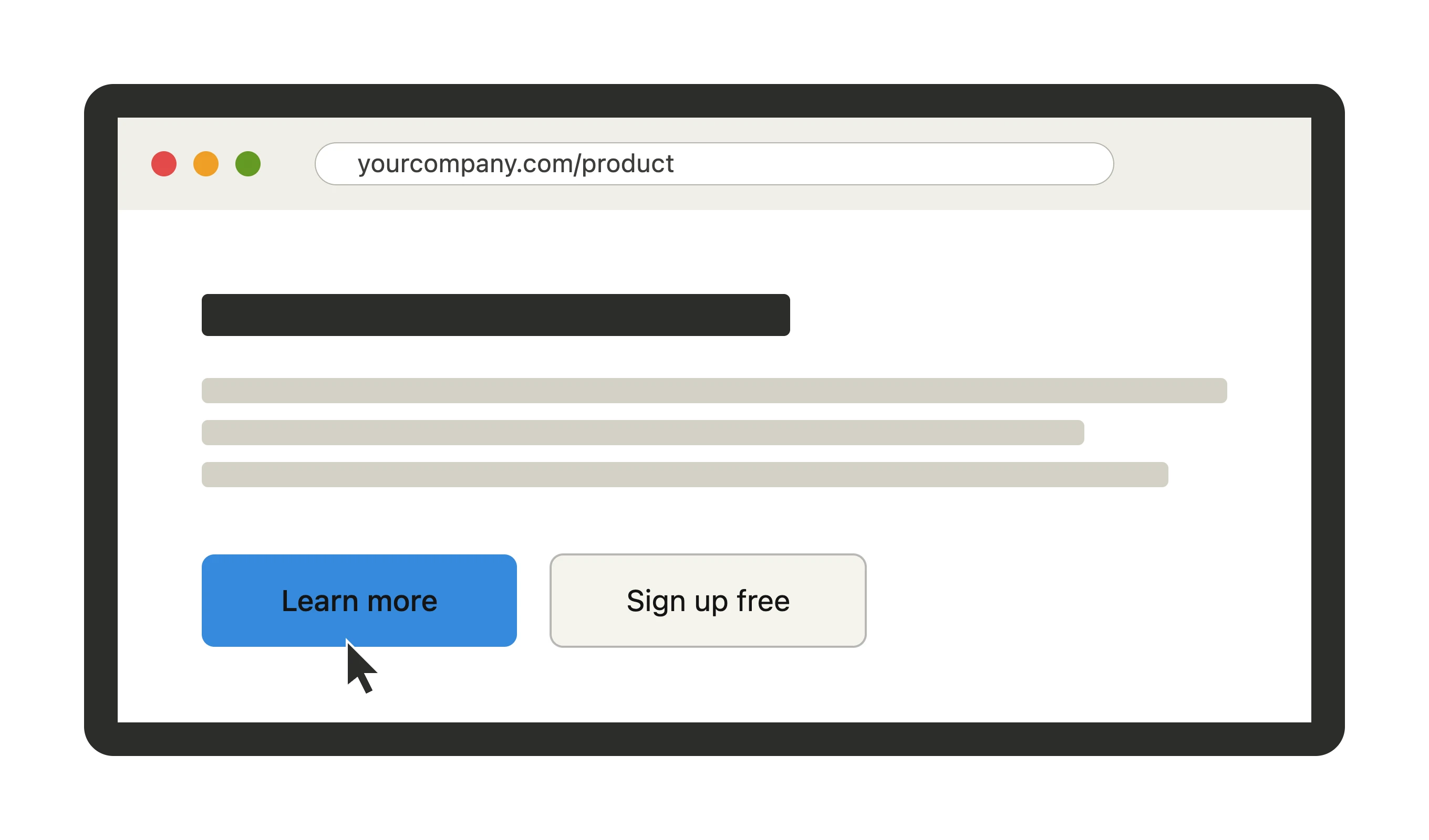
Learn moreon /productLearn more about audit reportsReason: The link sits under the “Accessibility audit reports” heading and points to the reports page, so the label should name that destination.
Example of a Destiny QA finding with a Gemini-generated replacement label.
The suggestion is a recommendation to review, not an automatic change. You stay in control of the final wording, which keeps your brand voice and the destination accurate.
Related guides
Fixing accessibility findings
What contrast, alt text, label, and landmark findings mean, and how to resolve them.
Understanding WCAG and accessibility levels
What WCAG 2.1 and 2.2 mean, how the conformance levels work, and which checks Destiny QA automates.
Reading report scores and quick wins
Use scores as a signal, then prioritize issues by risk, effort, and audience.
Find vague links on your site
Run a free audit on your site
Destiny QA checks every page for non-descriptive link text and the other most common WCAG failures, then shows you exactly where to start.
Start free