The 6 Most Common Accessibility Failures (and How to Fix Each One)
According to the annual WebAIM Million report, the same six failure types consistently account for the majority of automatically detected WCAG errors across the web. They are not the most complex accessibility problems. They are the most common ones, and fixing them removes barriers for the widest possible group of users.
Why the same failures appear every year
The WebAIM Million report audits one million home pages each year for WCAG compliance. In 2026, 95.9% of home pages had at least one detectable failure. Six failure types were responsible for 96% of all detected errors, appearing across sites built by agencies, startups, and enterprise teams alike. They persist not because they are difficult to fix, but because they are easy to overlook without tooling in place.
95.9%
home pages with WCAG failures
WebAIM
6
failure types cause most errors
WebAIM
1M+
pages audited annually
WebAIM
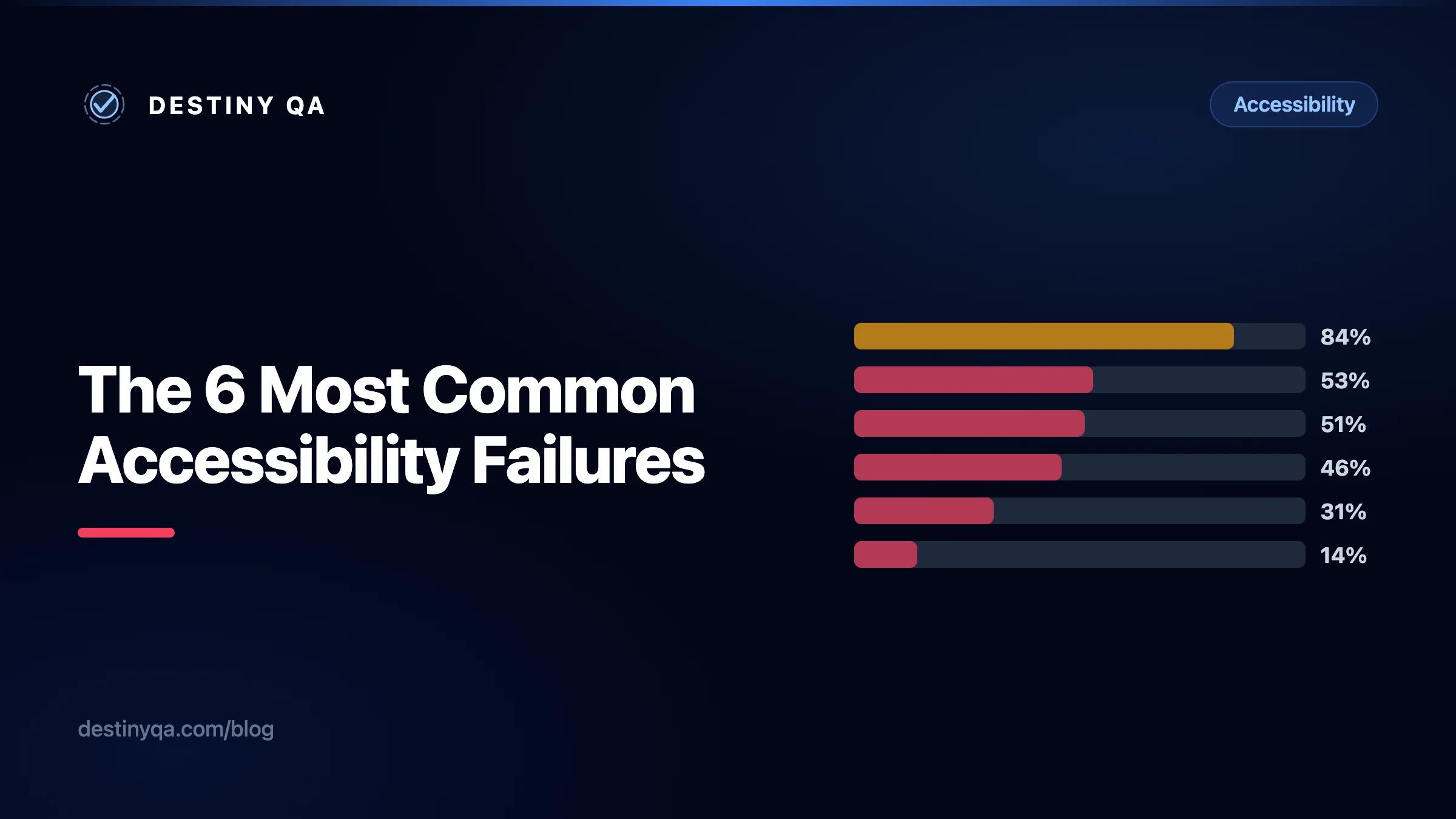
Most common WCAG failures (% of home pages affected)
Percentage of home pages with each failure type detected. Source: WebAIM Million (2026)
01. Low contrast text
According to the WebAIM Million report, low contrast text is consistently the most commonly detected accessibility failure, and it affects the widest group of users: people with low vision, colour blindness, cataracts, and anyone reading in bright sunlight. WCAG 1.4.3 requires a minimum contrast ratio of 4.5:1 for normal text and 3:1 for large text (18pt or 14pt bold). The most common cause is light grey text on a white background: it looks clean in a design tool and fails in practice.
Contrast failures are often baked into a design system rather than appearing on individual pages, which means fixing them at the token level fixes them site-wide. Contrast should be checked during design sign-off, not after the site is live.
/* Fails WCAG AA: #999 on white = 2.85:1 contrast ratio */
.body-text {
  color: #999999;
  background-color: #ffffff;
}/* Passes WCAG AA and AAA: #595959 on white = 7.4:1 ratio */
.body-text {
color: #595959;
background-color: #ffffff;
}Quick tip
Check any text-colour pairing with the WebAIM Contrast Checker before sign-off. Most modern design tools (Figma, Sketch) have built-in contrast plugins that catch failures before a design reaches development.
02. Missing image alt text
When an image has no alt attribute, many screen readers will announce the filename, producing something like "quarterly-growth-chart dot png". Behavior varies by browser and assistive technology, but in each case the user receives no meaningful description. When alt is present but empty on an informative image, the image is simply invisible to users who cannot see it.
The fix depends on the image's purpose. Informative images need alt text that describes their purpose in context. Decorative images (backgrounds, dividers, visual flourishes) should use an empty alt attribute so assistive technology skips them entirely.
<!-- No alt attribute: screen reader reads the filename instead -->
<img src="quarterly-growth-chart.png" /><!-- Informative image: alt describes what it conveys in context -->
<img
src="quarterly-growth-chart.png"
alt="Bar chart showing 40% revenue growth from Q1 to Q2."
/>
<!-- Decorative image: empty alt so screen readers skip it -->
<img src="background-wave.svg" alt="" />Quick tip
Alt text describes the image's purpose, not its appearance. "Woman using laptop" tells a user almost nothing. "Customer service agent responding to a live chat" tells them why the image is there.
03. Missing form labels
Placeholder text is not a label. When a user focuses on an input field, the placeholder disappears, leaving people who rely on screen readers without any indication of what the field is for. This affects checkout and sign-up forms in particular, where a user filling in multiple fields cannot tell which field they are in once they start typing.
Every input must have a programmatically associated label: a visible <label> linked via matching for and id attributes, an aria-label, or an aria-labelledby pointing to visible text elsewhere on the page.
<!-- Placeholder disappears when user starts typing — not a label -->
<input type="email" placeholder="Email address" name="email" /><!-- Visible <label> linked to input via matching for and id -->
<label for="user-email">Email address</label>
<input type="email" id="user-email" name="email" placeholder="you@example.com" />Quick tip
If the design requires a label-free input (a search bar, for example), use aria-label="Search" on the input element. The label exists for assistive technology without being visible on screen.
04. Empty links
In WCAG terms, an empty link is one that has no accessible name, meaning there is nothing for assistive technology to announce other than the generic "link" role. The most common cause is wrapping an icon or image in an anchor tag without providing any text for assistive technology. Screen readers encounter the link, have nothing to call it, and announce it as "link" with no further context. For keyboard users navigating a page full of unlabelled icon links, the page becomes effectively unusable.
Every link needs an accessible name, either through visible link text, an aria-label, or a visually-hidden text node. The name should describe where the link goes, not what the icon looks like.
<!-- No accessible name: screen reader announces "link" only -->
<a href="/settings">
  <svg viewBox="0 0 24 24" width="20" height="20">...</svg>
</a><!-- aria-label gives the link a descriptive accessible name -->
<a href="/settings" aria-label="Go to account settings">
<svg viewBox="0 0 24 24" width="20" height="20" aria-hidden="true">...</svg>
</a>05. Empty buttons
Empty buttons are the button equivalent of empty links. An icon-only button with no text content and no aria-label gives screen reader users no information about what the button does. Common examples include close buttons on modals, hamburger menu toggles, and social share buttons built with SVG icons.
Adding aria-label to the button element and aria-hidden="true" to the icon is a common and effective fix in most contexts. Where visible text can be added alongside the icon, that is often the clearer choice.
<!-- No accessible name: screen reader announces "button" only -->
<button type="button">
  <svg viewBox="0 0 24 24" width="20" height="20">
    <path d="M6 18L18 6M6 6l12 12" />
  </svg>
</button><!-- aria-label names the button; aria-hidden hides the icon from AT -->
<button type="button" aria-label="Close dialog">
<svg viewBox="0 0 24 24" width="20" height="20" aria-hidden="true">
<path d="M6 18L18 6M6 6l12 12" />
</svg>
</button>06. Missing document language
Screen readers use the lang attribute on the <html> element to select the correct pronunciation engine. When it is missing, the screen reader defaults to the user's system language. For a French screen reader visiting an English page, the content is read using French phonetics, making it difficult or impossible to follow.
This is one of the fastest fixes in accessibility: one attribute, one line, site-wide impact. It is also one of the few things that cannot be caught by visual testing.
<!-- No lang: screen reader guesses language from OS settings -->
<!DOCTYPE html>
<html>
  <head>...</head>
</html><!-- lang declares the primary language so AT selects the right engine -->
<!DOCTYPE html>
<html lang="en">
<head>...</head>
</html>Quick tip
Use a valid BCP 47 language tag: lang="en" for English, lang="en-IE" for Irish English, lang="fr" for French. Pages with sections in a different language can carry the lang attribute on those elements too.
Where to start
If you have limited time, prioritise failures 02 through 06 first. They are all Level A (the most fundamental WCAG tier), most are fixable in minutes, and the code change is one or two attributes. Together, they represent a significant reduction in real-world barriers.
Contrast (01) affects the most users, but it is Level AA and often requires changes to a design system, which takes longer to roll out safely. Fix the Level A failures first, then address contrast with your design team.
Start here (Level A)
- Missing image alt text
alt="Describe the image purpose"
- Missing form labels
<label for="input-id">Label</label>
- Empty links
aria-label="Go to [destination]"
- Empty buttons
aria-label="Action name"
- Missing document language
<html lang="en">
Next priority (Level AA)
- Normal text (under 18pt)
color: #595959; /* 7.4:1 on white — passes AA */
- Large text (18pt or 14pt bold)
color: #767676; /* 4.6:1 on white — passes AA */
What Destiny QA detects automatically
All six failure types are automatically detectable. Destiny QA crawls every page on your site and checks for contrast failures, missing alt text, empty links, unlabelled form fields, empty buttons, and missing language declarations. Findings are grouped by page so you can see where the density is highest, alongside the WCAG criterion, severity, and a description of what to fix.
Because the audit runs on every crawled page, contrast failures baked into a shared component show up across every page that uses it, not just the page you happened to test manually.
| Failure | WCAG | Auto-detected |
|---|---|---|
| Low contrast text | 1.4.3 | Yes |
| Missing alt text | 1.1.1 | Yes |
| Missing form labels | 4.1.2 / 1.3.1 | Yes |
| Empty links | 2.4.4 | Yes |
| Empty buttons | 4.1.2 | Yes |
| Missing document language | 3.1.1 | Yes |
Related guides
Fixing accessibility findings
What contrast, alt text, label, and landmark findings mean, and how to resolve them.
Understanding WCAG and accessibility levels
What WCAG 2.1 and 2.2 mean, how the conformance levels work, and which checks Destiny QA automates.
Reading report scores and quick wins
Use scores as a signal, then prioritize issues by risk, effort, and audience.
Find these failures on your site
Run a free audit on your site
Destiny QA checks every page for all six failure types and shows you exactly where they appear, which pages carry the most, and what to fix first.
Start free