WCAG Colour Contrast: What It Covers and Where Teams Get It Wrong
Colour contrast is the most commonly detected WCAG failure on the web. Most teams know to check text against its background, but similar contrast requirements apply across multiple WCAG criteria covering button outlines, form field borders, icons, and focus rings. Here is what the standard actually covers and how to check the full picture.
Why it stays the most common failure
According to the WebAIM Million report, low contrast text was found on 83.9% of the top one million home pages in 2026, and it has consistently topped the list of most common failures across recent annual editions of the report.
The persistence is partly a design tool problem. Light grey text looks refined on a calibrated monitor in a well-lit room. The same text becomes unreadable on a mobile screen in sunlight, or for anyone with reduced vision, cataracts, or colour blindness. The failure is rarely intentional. It is invisible until you actually measure the ratio.
The other reason contrast keeps failing is scope. Teams often fix text contrast and miss the same problem on button outlines, form field borders, icons, and focus indicators. WCAG has three separate criteria and each covers different things.
Three requirements, not one
Contrast requirements in WCAG 2.2 span three different success criteria, each with its own threshold, scope, and conformance level.
- Covers
- Text and images of text
- Threshold
- 4.5:1 for normal text, 3:1 for large text
- Note
- The most widely known criterion. Covers body copy, headings, labels, placeholder text, and text inside buttons.
- Covers
- UI components and informational graphics
- Threshold
- 3:1 against adjacent colours
- Note
- Added in WCAG 2.1. Covers button outlines, input field borders, checkboxes, and icons that convey meaning on their own.
- Covers
- Keyboard focus indicators
- Threshold
- 3:1 contrast plus minimum size/area requirements — see the understanding document for exact measurement rules
- Note
- New in WCAG 2.2. Requires focus indicators to be visible with a minimum contrast ratio and a minimum enclosed area. Level AAA; many teams adopt it as a practical target.
Text contrast in practice (WCAG 1.4.3)
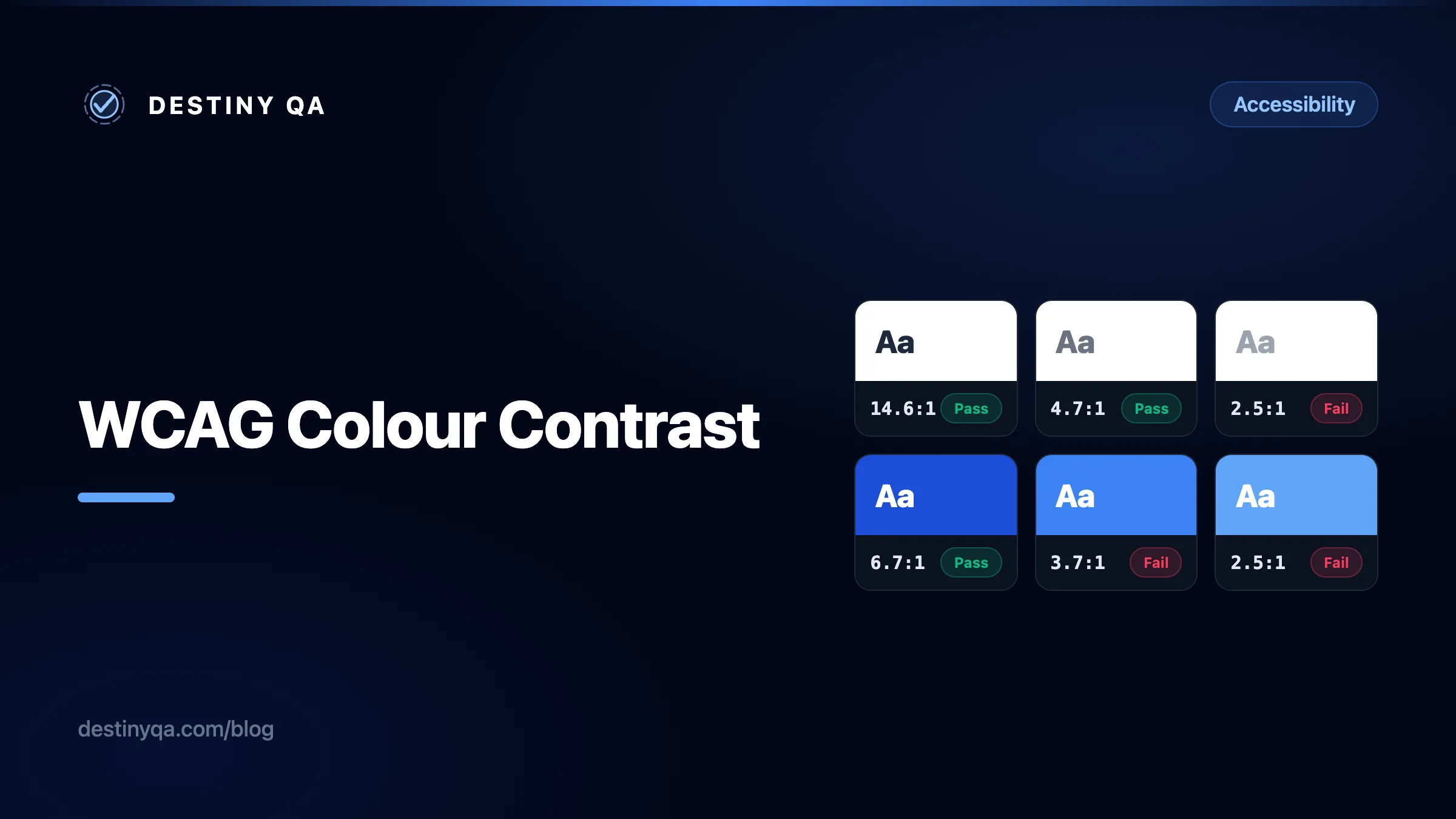
The 4.5:1 threshold is what most teams are familiar with, but it is easy to fail without realising. The three shades below illustrate a common progression: the first is a grey that many design systems use for secondary text, the second is the minimum value that clears the AA bar on white, and the third passes AAA.
Left: #9ca3af (gray-400). A common "muted text" choice that fails every threshold. Middle: #6b7280 (gray-500). Just above the AA line for normal text. Right: #595959. Passes AAA.
/* Fails AA: 2.5:1 on white — too light for body copy */
.secondary {
  color: #9ca3af; /* gray-400 */
}

/* Fails AA: 3.5:1 on white — misses the 4.5:1 threshold */
.body {
  color: #888888;
}/* Passes AA: 4.7:1 on white */
.secondary {
color: #6b7280; /* gray-500 — minimum safe muted text on white */
}
/* Passes AAA: 7.0:1 on white */
.body {
color: #595959;
}What counts as large text?
The WCAG 1.4.3 understanding document defines large text as at least 18 pt (24 px) at normal weight, or at least 14 pt (approximately 18.7 px) in bold. A heading at 20 px regular weight does not qualify, so the 4.5:1 threshold still applies. When in doubt, apply 4.5:1 across the board and use the 3:1 concession only for text that is visibly and clearly large.
Placeholders are not exempt
Placeholder text inside form fields must meet the same 4.5:1 threshold as any other visible text under 1.4.3. The light grey default placeholder is one of the most common failures in this category. Note that fixing contrast on a placeholder does not make placeholder-only labelling acceptable: inputs still need a persistent, associated label to satisfy WCAG 1.3.1.
Non-text contrast: borders, icons, and UI components (WCAG 1.4.11)
WCAG 1.4.11 requires a 3:1 contrast ratio for the visual boundaries of UI components against adjacent colours. For a form field, the border must be 3:1 against the background it sits on. For an icon-only button, the icon itself must be 3:1 against its background.
The most common failure is an input with a light grey border on a white page. A border such as gray-300 (#d1d5db) sits at roughly 1.5:1 against white, well below the threshold.
border #d1d5db — 1.5:1 on white
border #6b7280 — 4.7:1 on white
/* Input border — fails 1.4.11: 1.5:1 against white */
input {
  border: 1px solid #d1d5db; /* gray-300 */
}

/* Icon in icon-only button — fails 1.4.11: 2.5:1 against white */
.icon-btn svg {
  color: #9ca3af; /* gray-400 */
}/* Input border — passes 1.4.11: 4.7:1 against white */
input {
border: 1px solid #6b7280; /* gray-500 */
}
/* Icon in icon-only button — passes 1.4.11: 4.7:1 against white */
.icon-btn svg {
color: #6b7280; /* gray-500 */
}What is exempt from 1.4.11?
Decorative graphics and inactive UI components are exempt. A full-width hero image is not a UI component. However, any graphic or icon that conveys information on its own (a chart, a warning icon, a status indicator) must meet 3:1 against its background. The WCAG 1.4.11 understanding document has a full list of what is and is not in scope.
Hover and focus states
Hover states
WCAG does not have a dedicated hover contrast criterion, but the existing ones still apply to every state. When a hover interaction changes a colour, the new combination must still meet 1.4.3 for text and 1.4.11 for non-text elements.
A common mistake is a blue button with white text that passes in its default shade and then lightens on hover to a shade where it no longer does. The button was already borderline, and the hover made it worse.
Failing pattern
Default
Hover
Focus
Corrected pattern
Default
Hover
Focus
The ratio shown in each cell is for the button text against the button background. The focus cell includes a ring ratio as an illustration. WCAG 2.4.13 evaluates contrast between the focused and unfocused appearance of the indicator, along with area requirements, so a single ring-to-background ratio does not capture the full criterion.
/* Default: white on blue-500 — fails AA: 3.7:1 */
.btn {
  background: #3b82f6;
  color: #ffffff;
}

/* Hover lightens it further — 2.5:1, fails even more */
.btn:hover {
  background: #60a5fa;
  color: #ffffff;
}/* Default: white on blue-700 — passes AA: 6.7:1 */
.btn {
background: #1d4ed8;
color: #ffffff;
}
/* Hover: white on blue-600 — passes AA: 5.2:1 */
.btn:hover {
background: #2563eb;
color: #ffffff;
}
/* Focus: white ring on dark blue — 6.7:1 contrast */
.btn:focus-visible {
outline: 3px solid #ffffff;
outline-offset: 3px;
}Focus indicators (WCAG 2.4.13)
WCAG 2.2 added a dedicated criterion for focus indicator appearance. At a high level, 2.4.13 requires that the focus indicator be visible, meet a minimum contrast ratio of 3:1 between the focused and unfocused appearance, and enclose a minimum area around the component. The exact measurement rules are specific to the criterion, so refer to the WCAG 2.4.13 understanding document for the full detail.
The most common failure is outline: none with no replacement, which removes visibility entirely. The second most common is replacing the default browser ring with something too thin or too low contrast to notice.
No visible focus indicator
Clear keyboard focus, 5.2:1 ring contrast
/* Removes the focus ring entirely — fails 2.4.7 and 2.4.13 */
:focus {
  outline: none;
}

/* Visible but too low contrast: 2.0:1 against white — fails 2.4.13 */
:focus-visible {
  outline: 2px solid #93c5fd; /* blue-300 */
}/* Passes 2.4.13: high contrast, minimum 3 px wide, offset so it clears the component */
:focus-visible {
outline: 3px solid #2563eb; /* blue-600: 5.2:1 against white */
outline-offset: 2px;
}
/* On dark backgrounds, switch to a light ring */
.dark-bg :focus-visible {
outline-color: #ffffff; /* high contrast on dark */
}Use :focus-visible, not :focus
The :focus-visible pseudo-class only shows the focus indicator when the browser determines keyboard navigation is active. Mouse users do not see an outline on click; keyboard and assistive technology users always do. It is supported in all current major browsers; Internet Explorer does not support it.
Checking your full colour palette
Checking one pair at a time works for a specific fix, but it does not tell you which combinations in your design system are safe to use together. A grid view is more practical for that: paste in every foreground and background token and see every combination at once.
The example below shows a simplified 3-by-3 grid. A real palette might have a dozen or more tokens, and many of the combinations will fail. The grid makes it easy to define which pairs are approved for use before they reach production.
| Fg/Bg | #ffffff | #6b7280 | #1e293b |
|---|---|---|---|
#1e293b | Aa 14.6:1 | Aa 3.0:1 | Aa 1.2:1 |
#6b7280 | Aa 4.7:1 | Aa 1.2:1 | Aa 4.7:1 |
#ffffff | Aa 1.0:1 | Aa 4.7:1 | Aa 14.6:1 |
Three tones, nine combinations. Dark on mid-grey (3.0:1) only passes for large text. White on white (1:1) and dark on dark are both unusable, as expected.
Paste in your entire colour palette and get an interactive grid showing the contrast ratio for every foreground and background combination. Filter by WCAG level to see at a glance which pairs are safe to use. Free, no account needed, and particularly useful during design system setup.
Enter a foreground and background colour and get an instant pass or fail against AA and AAA. Includes an interactive slider to adjust the colour until it passes. Good for checking individual pairs during development or code review.
Shows how a colour combination looks to people with different types of colour vision deficiency, low vision, and blindness. Useful for demonstrating the impact of contrast failures to a design team.
Figma users
Various Figma plugins provide contrast checking within the design file, including 1.4.11 checks for UI component boundaries. Running checks at design stage catches failures before they reach development.
Fix it at the token level
Contrast failures found across a site usually trace back to a small set of colour values, defined once and reused everywhere. Fixing the value at source is faster and more reliable than hunting it down page by page.
CSS custom properties make this straightforward. Documenting the ratio alongside each token means any future change can be evaluated before it ships, and the intent is clear to anyone reading the file.
/* Define tested colour pairs at token level — fix once, applies everywhere */
:root {
  /* Text colours, all tested on white (#fff) */
  --color-text-primary:   #1e293b;  /* 14.6:1 — AAA */
  --color-text-body:      #334155;  /*  9.8:1 — AAA */
  --color-text-secondary: #475569;  /*  7.6:1 — AAA */
  --color-text-muted:     #6b7280;  /*  4.7:1 — AA  */

  /* UI components — 3:1 minimum required by 1.4.11 */
  --color-border-input:   #6b7280;  /*  4.7:1 against white */
  --color-icon-default:   #6b7280;  /*  4.7:1 against white */
  --color-focus-ring:     #2563eb;  /*  5.2:1 against white */
}
With tokens in place, a contrast failure found in an audit means updating one value, not searching through a codebase. If a colour ever changes, the comment tells you exactly what ratio to re-verify.
What Destiny QA detects automatically
Destiny QA checks every crawled page for contrast failures against WCAG 1.4.3 and flags each instance with the computed ratio, the element, and the criterion being violated. Each finding includes a screenshot that shows the failing element highlighted in context, so you can see at a glance exactly what is affected and where it sits on the page.
Findings are grouped by page so you can see where failures are densest and which pages are pulling the overall score down. Because the check runs across the whole site on every audit, a problematic colour value baked into a shared component appears on every page that uses it. That is usually the fastest way to trace a failure back to the design system value that is responsible.
About our team
We build software that makes the world easier to navigate.
Our mission is to remove friction from every step of the journey.
Screenshot captured automatically on every audit. Highlights show the exact failing element in context.
Related guides
Fixing accessibility findings
What contrast, alt text, label, and landmark findings mean, and how to resolve them.
Understanding WCAG and accessibility levels
What WCAG 2.1 and 2.2 mean, how the conformance levels work, and which checks Destiny QA automates.
Reading report scores and quick wins
Use scores as a signal, then prioritize issues by risk, effort, and audience.
Find contrast failures on your site
Run a free audit on your site
Destiny QA checks every page for contrast failures, missing labels, and the other common WCAG issues, then shows you exactly where to start.
Start free